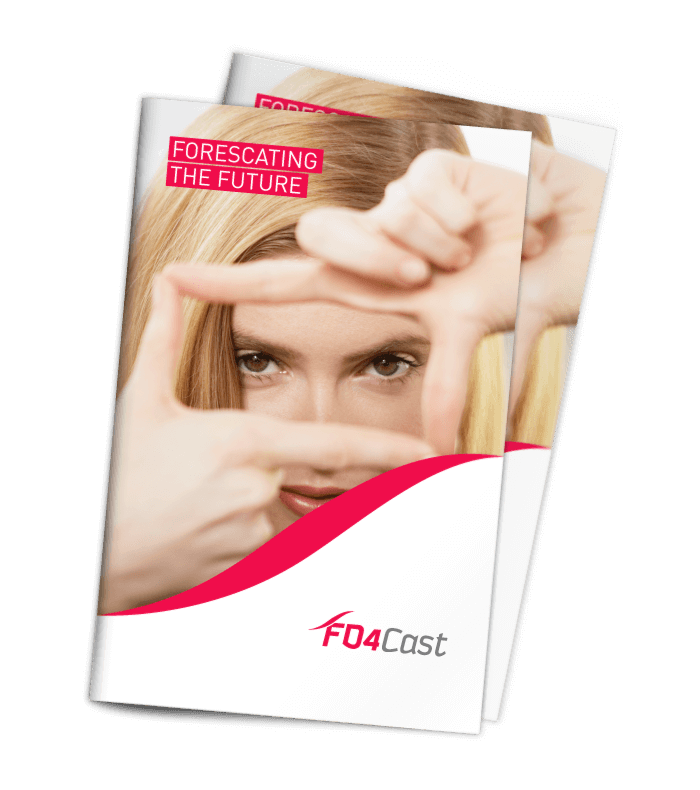
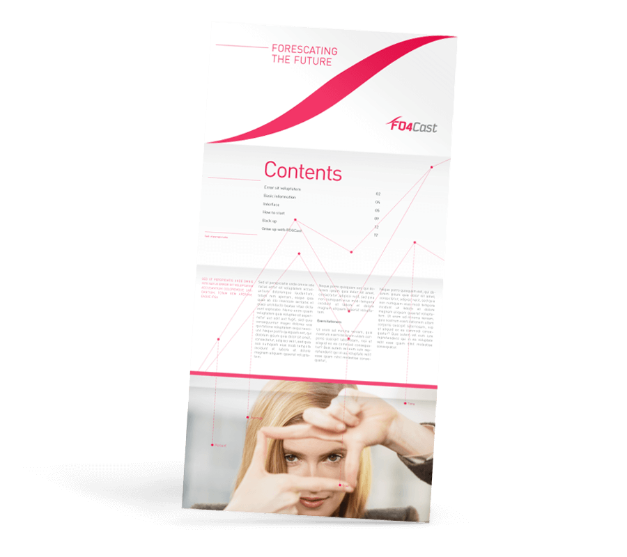
FD4Cast
The new brand had to defy the antiquated image that other similar products have in this particular market segment.
We chose a modern and dynamic typography that portrays some of the characteristics of the financial world: ups and downs and a fast-paced environment. The colour red is connotative of energy and strength. We used a neutral grey as support which communicates confidence and logical thinking. We created the product brand, designed the brochure and ads.
Role: Brand Design Year: 2010
![](https://vrij.com.uy/wp-content/uploads/2015/12/fd4cast-1.png)
![](https://vrij.com.uy/wp-content/uploads/2015/12/fd4cast-2.png)
![](https://vrij.com.uy/wp-content/uploads/2015/12/fd4cast-3.png)
![fd4cast-4](https://vrij.com.uy/wp-content/uploads/2015/12/fd4cast-4.png)
![fd4cast-5](https://vrij.com.uy/wp-content/uploads/2015/12/fd4cast-5.png)